The job market obviously hasn’t been too great the past couple of years. I hurried off to the welcoming arms of grad school soon after the news media started throwing around the phrase “The Great Recession”, which sounds like a way of saying, “We aren’t actually telling you to panic, but if we can spook you into watching more CNN coverage that’d be great.” And it’s no secret that Obama’s approval ratings haven’t fared so well either: apparently they keep hitting new and peculiar record lows. So this got me wondering: how much do people blame the President for a stalling economy? This is a hard question to precisely answer (correlation having a pesky habit of not equaling causation and all), but we can pose the problem in a simpler way: do areas that experience increased unemployment also tend to increase their disapproval of Obama? Fortunately, this is a more answerable question. We have yearly data of unemployment rates on the county level, and we also have county-level voter data from US presidential elections. With these datasets, we can determine whether there exists a correlation between the change in unemployment between 2008 and 2012 and the change in the percentage of Obama voters between the presidential elections in those two years. (Plus, these datasets give me a flimsy excuse to learn how to work with pandas for Python.) After the appropriate filtering, scrubbing, and merging of datasets, we’re ready to visualize the data. Here are plots of the shifts in unemployment rate and Obama’s presidential election vote percentage between 2008 and 2012: 
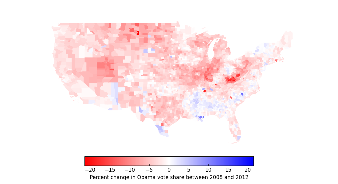 No big surprises here. During those four years, a lot of people lost their jobs and the country got a lot redder. (But check out North Dakota’s job growth! It must be all that black gold and Texas Tea.) So now let’s see if there’s a correlation between more unemployment and fewer votes for Obama:
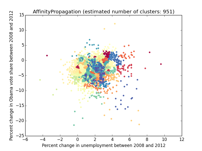
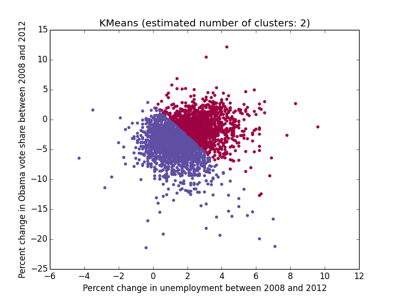
 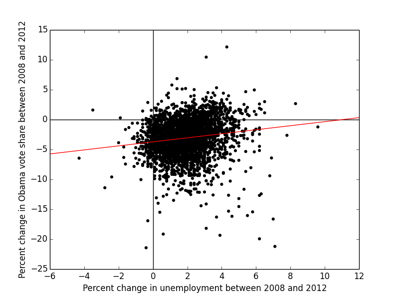 Uh – hmm. This is interesting. Pearson’s r for this correlation is +0.14 (with a two-tailed p-value of 5×10-16), which indicates a positive trend between change in unemployment rate and change in Obama vote share between 2008 and 2012. (That’s also evident from the red regression line above.) Put another way, counties that experienced higher unemployment growth between the two elections tended to see their vote percentage for Obama erode less than those counties whose unemployment rates didn’t increase as much. (However, given that the r2 value of this correlation is 0.02, we certainly can’t attribute very much of the variation in our data to that trend.) This is the opposite of what I had expected. Perhaps the counties with the most job loss have something else in common – perhaps they’re more urban, for instance – and more urban counties tend to be more loyal to Democratic presidents? (That sounds like a good subject for a future post…) Regardless, there’s still more to explore with this dataset. For instance, what’s up with the loose clump of points in the bottom right corner of the plot, corresponding to counties with both massive job loss and a massive shift away from Obama? Do those counties have anything in common? Trying to separate out just those points using scikit-learn‘s clustering algorithms seems to be tricky, as I’ve discovered, but we can take a simpler approach and simply pick out those counties with an unemployment shift z-score above +2 and an Obama vote shift z-score below -2. That selects out the points in green below:
  which correspond to the following counties:
  A lot of that is West Virginia, which, as some people surmise, might be becoming more Republican as part of a generational shift away from its coal-mining, pro-union past. Anyway, playing around with open county-level data can be fun, and this is certainly just the beginning. I’ll see what other trends I can find by scraping data off of the US Census website and combining it with the data I have now.
The code for this project can be found at https://github.com/EricMichaelSmith/voting_economy_correlation.
