Growing up in rural Pennsylvania, the 2000 US presidential election was a watershed moment for me. Not only did it give me the excuse to drop the phrase “hanging chad” into colloquial conversation, but the media’s intense study of Democratic- and Republican-leaning states (which it famously termed “blue states” and “red states”, respectively) also made me start to wonder why my region of the state happened to tilt Republican. I apparently wasn’t the only one: a few months after the election, out of all of the tiny, 3,000-person towns in the country, Newsweek decided to feature my hometown (!) in an article that contrasted it with the Democratic-leaning city of Scranton to the south, holding up the two communities as examples of the growing red-state/blue-state cultural divide. (If there was ever to be a sign from the gods that I should become an armchair and completely amateur political stats devotee, this was it.)
With that curiosity about political divisions in mind, I was looking for a project involving open data in order to develop some predictive modeling skills, and I stumbled upon this question: can I find the demographic features of a county that were most predictive of percentage vote share for Obama in the 2012 election? Since the areas of the country that vote for Democratic presidential candidates and the areas that vote for Republican candidates have tended to be rather consistent over the last few presidential elections, I thought I could use election results in the 2012 election to make inferences about the political leanings of different regions of the country more generally. From articles I had read in the past, several potential predictors of political bent came to mind, some obvious (rural areas lean Republican and urban areas lean Democrat) and some less obvious (Whole Foodinistas for Obama, Cracker Barrelers for Romney!). But if I simply joined together dozens of different pieces of demographic information (age, sex, population density, etc.) and sifted through them, could I determine if certain features were clearly more important than others? To test this out, I downloaded the vote totals of the 2012 US presidential election on the county level, conveniently made available by The Guardian, which allowed me to re-create the commonly seen “purple-state” map below, hinting at political leaning by county:
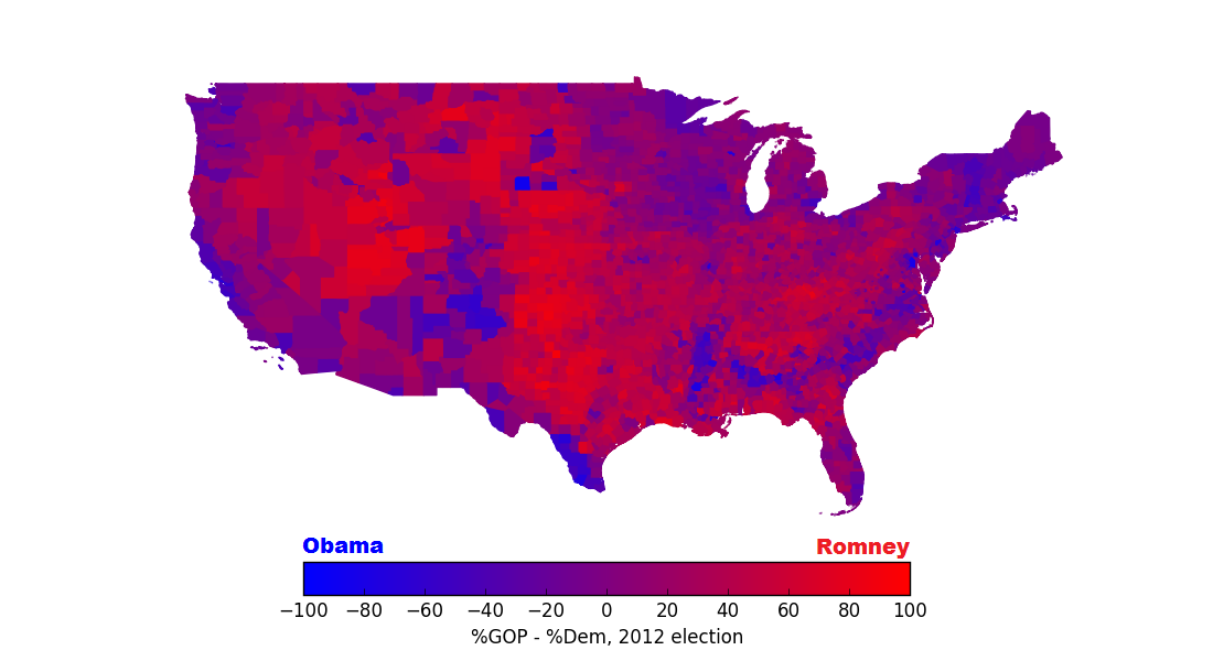
Counties in the contiguous United States, colored by the percent to which they voted for Romney over Obama or vice versa: for instance, a county in which Obama received 59% of the votes and Romney received 39% would be colored the shade of purple shown by “-20” on the color bar.
Gathering demographic data
After having grabbed 2012 election data, my goal was next to find the strongest demographic indicators of why red counties tend be red and blue counties tend to be blue. To do this, I downloaded 11 data sets from sources like the US Census Bureau, the Bureau of Labor Statistics, and the Robert Wood Johnson Foundation, each one containing demographic information on the level of single US counties. I combed through them to find specific demographic features, 26 in total, that seemed distinct enough to include in a massive model without repeating other features in the model. I scrubbed the datasets in Python and imported them into a MySQL database, and I then plotted values of various demographic features on a map of all US counties to see if I could find any interesting patterns. For instance, here are the median age, median household income, percentage of citizens who have never been married, and gender ratio per county:

Several demographic features plotted on the US county level: median age, median household income in 2012, percent never married, and gender ratio. All statistics other than median household income are 5-year estimates from 2012.
We can see some interesting outliers here: a splotch of dark orange in the median age plot in Florida, a band of orange on the median household income plot for the Richy McRichingtons here in the Boswash corridor, and, on the gender ratio plot, a spot of shining lonely blue representing our great nation’s least populated county, good ol’ Loving County, TX. But of course we want to learn about more than just interesting anomalies: we want to understand how these pieces of data predict how people voted in 2012. More specifically, it’d be great to use our data to answer the following questions:
- Can we determine which demographic features best explain by how much counties voted for Obama or Romney in 2012?
- And can we show how many of these features are actually predictive of voting trends (as opposed to simply being statistical noise in our data)?
Understanding our demographic data
In order to answer question 1 above, the naïve thing to do might be to load up the scikit-learn Python library and test the strength of the correlation between each individual demographic feature and the percentage voting share for Obama vs. Romney, as shown below:
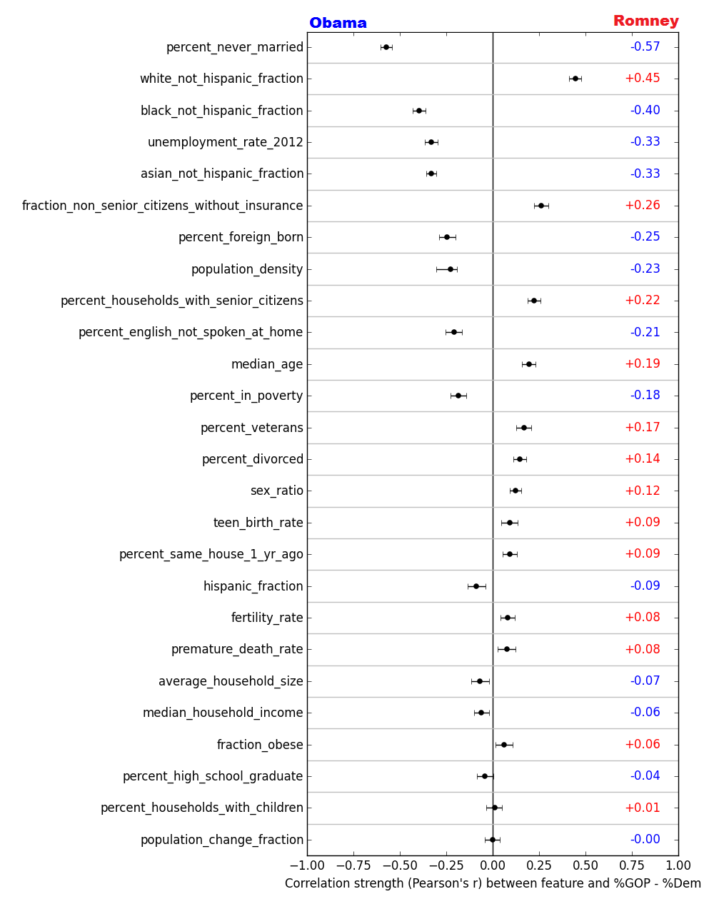
Pearson’s r of the correlation between individual demographic features and the spread of votes for Romney vs. Obama in the 2012 US presidential election. Intervals represent 95% confidence intervals obtained through bootstrapping. For almost all features, this confidence interval does not include r = 0: this gives us evidence that there exists some correlation of those features with voting trends, even if it’s only a small one.
The further each point is to the left or the right of the center line, the more strongly correlated that feature is with how counties voted in 2012. I’ve ranked the features here by the strength of their correlation with voting trends: at the top, we see that the single demographic feature most strongly correlated with voting for Obama is the percentage of citizens in the county who have never been married. (This marriage-based partisan divide has been observed before, by the way.)
For the demographic features that have the strongest correlation with voting for Obama vs. Romney, these correlations are pretty easy to see by eye. Below are scatter plots of the six most strongly correlated demographic features, each plotted against the difference between the Obama and Romney vote percentages in the 2012 election:
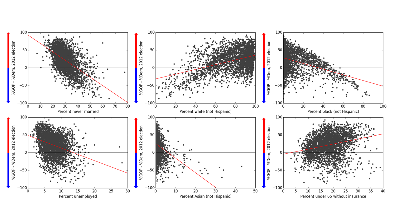
Difference in percentage of votes for Romney and Obama in the 2012 US presidential election, plotted against the six individually strongest demographic correlators, for single US counties. The higher the position along the y-axis, the higher the percentage share of votes was for Romney than for Obama. Red lines are attempts to fit lines to scatter plots via linear regression: in most cases these are clearly pretty poor fits to the observed distributions. (I mean, holy heteroscedasticity, Batman!)
However, just because these six features are most strongly correlated with 2012 voting results doesn’t mean that, if you wanted to predict by how much a county voted for Obama over Romney or vice versa, these are the six features you’d most want in your model: after all, some of these demographic variables are obviously quite dependent on each other. (For instance, the percentage of white citizens in a county obviously has some correlation with the percentage of African-American citizens in a county, which might have something to do with the two “fingers” of points of roughly opposite slope on the top middle and top right plots on the above figure.) In fact, we can visualize just how correlated all of these demographic features are with each other by creating a heatmap of the strength of the correlation between each pair of features (a greener square indicates a more positive correlation and a redder square indicates a more negative correlation):

Heatmap of the correlations between pairs of demographic features on the county level: strong positive correlations are shown in green and strong negative correlations are shown in red.
You can find many interesting and often sobering correlations in this plot – if you’re ever feeling too positive about the state of racial and socioeconomic equality in the US, a quick look at this chart should cure that. Anyway, we’d like to figure out which features are most strongly predictive of voting for Obama vs. Romney in a way that takes these correlations into account: in other words, if demographic features A and B are both strongly correlated with percentage of votes for Obama but also with each other, then it’s likely that the power of A in explaining voting trends is partially due to its correlation with B and vice versa. Thus, if we build a model for explaining voting trends and we include feature A, we wouldn’t have as much of a need for feature B anymore, because B wouldn’t add much predictive power to the model that is not already found in A. There are a bunch of different methods that we could use to get some idea of the ranking of the relative importance of the different features, and I’ll briefly discuss my attempts to use two of these methods to get a sense of which demographic features are most important. (Spoiler alert: both methods say that the same 3 or 4 features are most predictive of voting trends.)
Selecting useful features: stepwise feature selection
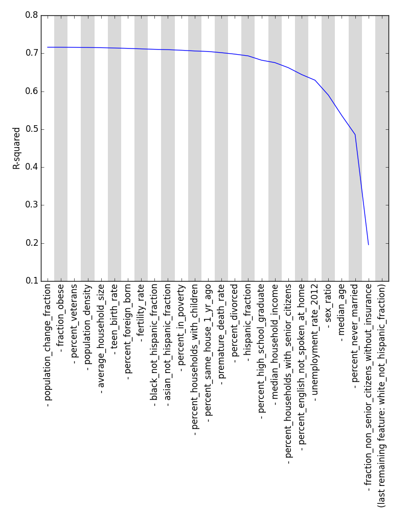
One way to rank the demographic features that isn’t influenced by correlations among the features themselves is to do a forward stepwise feature selection. With this technique, we find the feature that best predicts voting trends on its own and use it as the first feature of our model, and then we add as a second feature the feature that most increases the accuracy that we already had with just one feature alone. We keep adding features one by one in this manner until all features have been added: once we’re done, the order in which features were added gives us a sense of the relative importance of each of the features in predicting voting trends.
How do we know how accurate our forward stepwise feature selection is? We can measure the accuracy with which our model predicts voting trends by looking at the model’s R2 value, which here measures the percentage of the variation in voting among counties that is explained by our model. Using R2, we get the following ranking of features, where the labels of features are ranked from most important to least important as you read left to right:
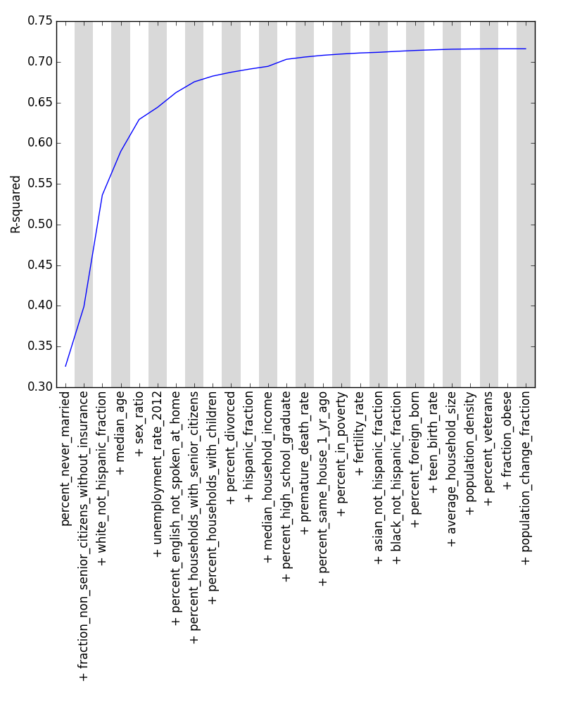
R2 of forward stepwise feature selection performed on our dataset: even with all features present, only slightly over 70% of the variance in voting among counties can be explained by our data.
Here, we see that the most important pieces of demographic information in explaining voting trends are (1) the percentage of people in a county who have never been married, (2) the percentage of citizens under 65 without health insurance, and (3) the percentage of citizens who are white. (Reassuringly, performing a backward stepwise feature selection, in which features are progressively removed rather than added, lists these same three features as being most important, albeit in a different order.) We see that these top three features from our stepwise feature selection (the second and third columns of the table below) are different than the top three features that have the strongest correlation with voting trends on their own (first column): this serves to show how much correlated features can skew our result.

Ranking of the most important demographic features in explaining voting trends in the 2012 US presidential election, as measured using forward stepwise feature selection (column 2), backward stepwise feature selection (3), and the strength of the coefficients of multiple linear regression without (4) and with (5) lasso regularization. For comparison, the top 10 features ranked by their correlation with the percentage of votes for Romney minus the percentage of votes for Obama (as measured by the magnitude of Pearson’s r) are given in column 1. Light blue shading marks the top 3 features, which are shared in common with all four ranking methods in columns 2 through 5; dark blue shading indicates other features that columns 2 through 5 all share in common in their top 10. Pluses and minuses reflect whether each feature is positively or negatively correlated, respectively, with a greater percentage of votes for Romney over Obama, and orange pluses/minuses reflect a feature whose coefficient in a multiple linear regression has the opposite sign of that of a single linear regression with that feature alone.
Of course, this stepwise feature selection doesn’t help us with our second question above, namely, how many of the features we’re considering actually predict voting patterns instead of contributing to noise. This is because, as you add features, the R2 value can only stay the same or increase: there’s nothing to distinguish between useful features and useless features. We can instead use metrics other than R2 that penalize features that don’t add predictive power to understanding a county’s Romney/Obama vote percentage: the statistic known as adjusted R2, for instance, will shrink if you add useless features. Four metrics that penalize excess features are shown in the following plot:

Forward stepwise feature selection with metrics that penalize useless features: from left to right, adjusted R2, cross-validated R2, AIC, and BIC. Dots represent maximum or minimum values, as appropriate, for each of the metrics.
For each metric, the position of the dot gives a rough idea of which features contribute constructively to predicting voting trends and which ones don’t. (Note that, for all metrics, most features are deemed to be at least a little useful for the model: however, which specific features these are varies from metric to metric.)
Selecting useful features: regularization
An alternative way of ranking features and determining which ones are important can be found by looking at the strengths of the coefficients of the features in our model, especially when regularized to prevent multiple correlated features from diluting each others’ importance in the model. Below I’ve plotted the relative coefficients of all features, and the three highest ones are the same features as before, namely, percentage of citizens never married, percentage of white citizens, and percentage of citizens under 65 without health insurance: a full list of the top ten features is given in the last two columns of the table above.

The relative strengths of all of the coefficients in the model. Red bars indicate coefficient strengths without regularization, and green, blue, and purple bars indicate coefficient strengths with various regularizations applied. The optimal parameters of the regularizations were determined by grid searches.
What does this tell us?
The fact that these three features (percentage of citizens never married, percentage of white citizens, and percentage of citizens under 65 without health insurance) are ranked most highly, both when using stepwise feature selection and when looking at the coefficients of a regularized regression, seems to confirm that they’re the most important predictors of how people voted in the 2012 election, at least among the predictors that I’ve studied here. You could possibly make the claim that these results seem rather obvious in hindsight (after all, given the Democrats’ and Republicans’ known biggest voting blocs, wouldn’t it make sense that counties with a higher percentage of white voters would tend to vote more for Romney?), but it’s great to see these results explicitly emerge from targeted analysis. This study could easily be extended further (and not only just to refresh the analysis with the results of the upcoming 2016 election): for example, I don’t consider factors relating to religion or whether a county is urban or rural, and those factors, among many others, surely affect voting patterns as well.
The code for this project can be found at https://github.com/EricMichaelSmith/county_data_analysis.
